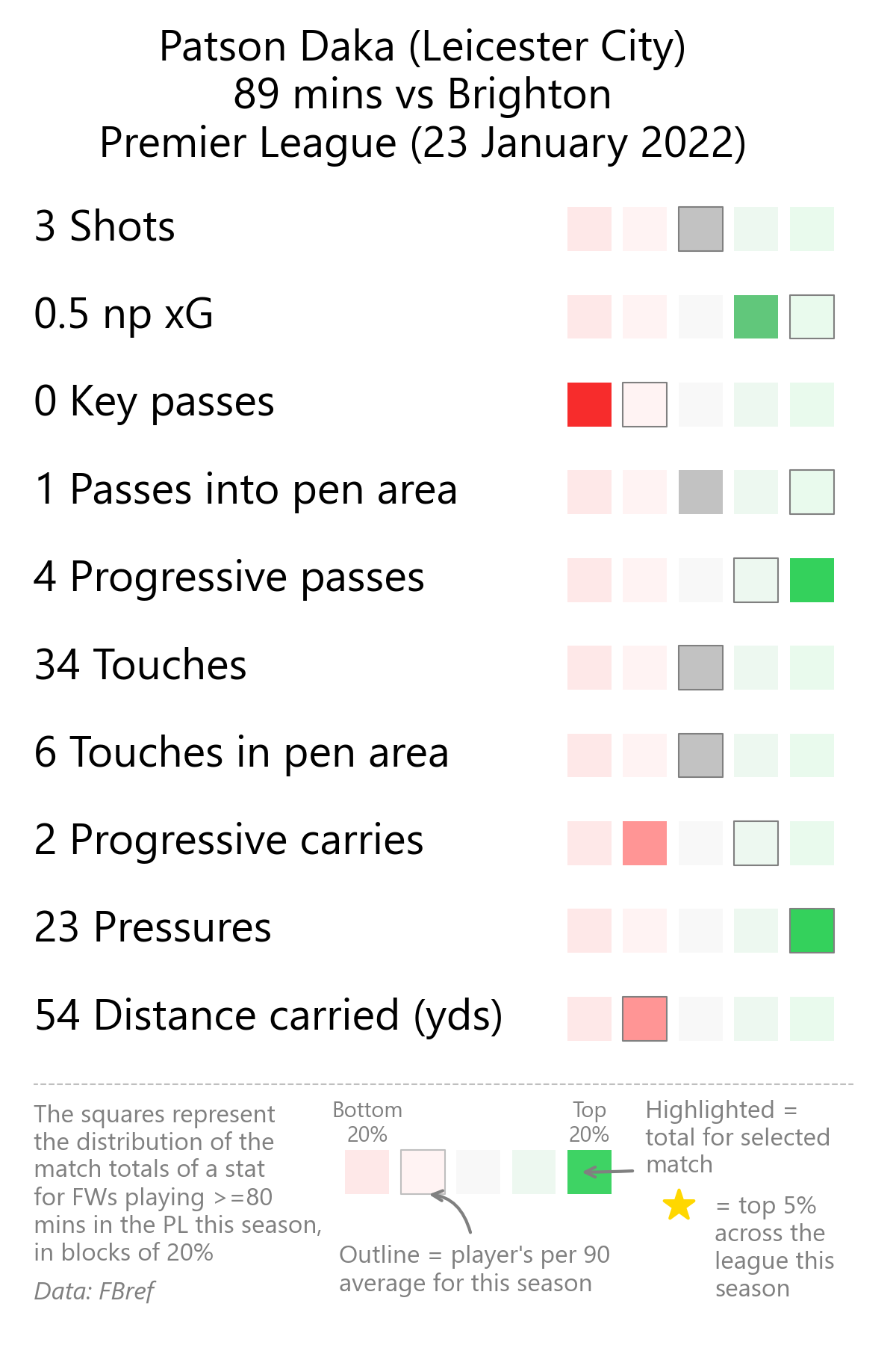
A popular use of football statistics online is presenting a player’s match totals for various metrics present in a list. E.g. “Jamie Vardy vs Liverpool: 3 shots, 5 dribbles, 8 tackles”
When I see this sort of thing, I can’t help thinking “so what?” Is five dribbles a lot? What does that player normally do? How does that compare to his teammates and the rest of the league? In other words, more context is needed. The below data viz is an effort to give context to these lists of statistics.

Some thoughts on the data viz design process:
-
Splitting the distribution of each statistic into quintiles - at a glance, you only really need to know if a statistic is very low, low, average, high or very high (compared to players in the same position) - anything more is overkill.
-
Adjusting the brightness to show the match value - this makes it easy to spot the match value at a glance - straight out of the pre attentive attributes playbook!
-
Marking the player’s season average with a border - this doesn’t immediately stand out but once you have looked at the graphic for a second or two you’ll notice it - it’s not the main part of the graphic but it’s not supposed to be - it adds more context and doesn’t overwhelm/distract the viewer.
-
The legend - it takes up quite a lot of space on the graphic but I think this is space well used. The brightness is adjusted down on this slightly (grey not black text) and added the dotted line separator to make it immediately obvious it’s not part of the main graphic. Having this reference point (with annotations) gives all the information the viewer needs to interpret the graphic.
-
Gold star - I think it’s cool to have an addition to the graphic to demonstrate the extreme end of the distribution, otherwise the 80th and 99th percentiles show up the same! This graphic is a bit like a scorecard/report card, so a gold star is a nod to that!
Clearly, counts are not a tool for serious analysis, but an improvement on contextless lists (I hope!)